Blog
We read 30 B2B software ads on Meta. Most made the same four mistakes
Of thirty live B2B software ads pulled from the Meta Ad Library, twenty-six ran as a single creative with no variants, twenty-two asked for a demo, and only seven named a specific problem in the opening line. The result is a category where the ads are close to interchangeable, which is an opportunity if you are willing to be specific.
By Suleman Aslam Virk, Co-founder · Updated
How was this put together?
Thirty ads from B2B software advertisers, captured from the Meta Ad Library in August 2026, coded against the same short list of questions.
The Ad Library is public and shows every ad an advertiser is currently running, which makes it the only honest window into what competitors are actually doing rather than what they say at conferences. It does not show performance, so nothing here is a claim about what worked. It shows what was chosen.
Advertisers were picked to spread across the segments we work with: development agencies, IT services firms and SaaS companies, all advertising to businesses rather than consumers. Anything running fewer than fourteen days was skipped.
Thirty is a small sample and it is not random, so treat the counts as a description of these thirty ads rather than an estimate of the category. The patterns were consistent enough to be worth writing down.
The Ad Library shows what advertisers chose, not what worked. Every count here is about decisions, not performance.
What did almost all of them do?
Four things, and each one is a default rather than a decision.
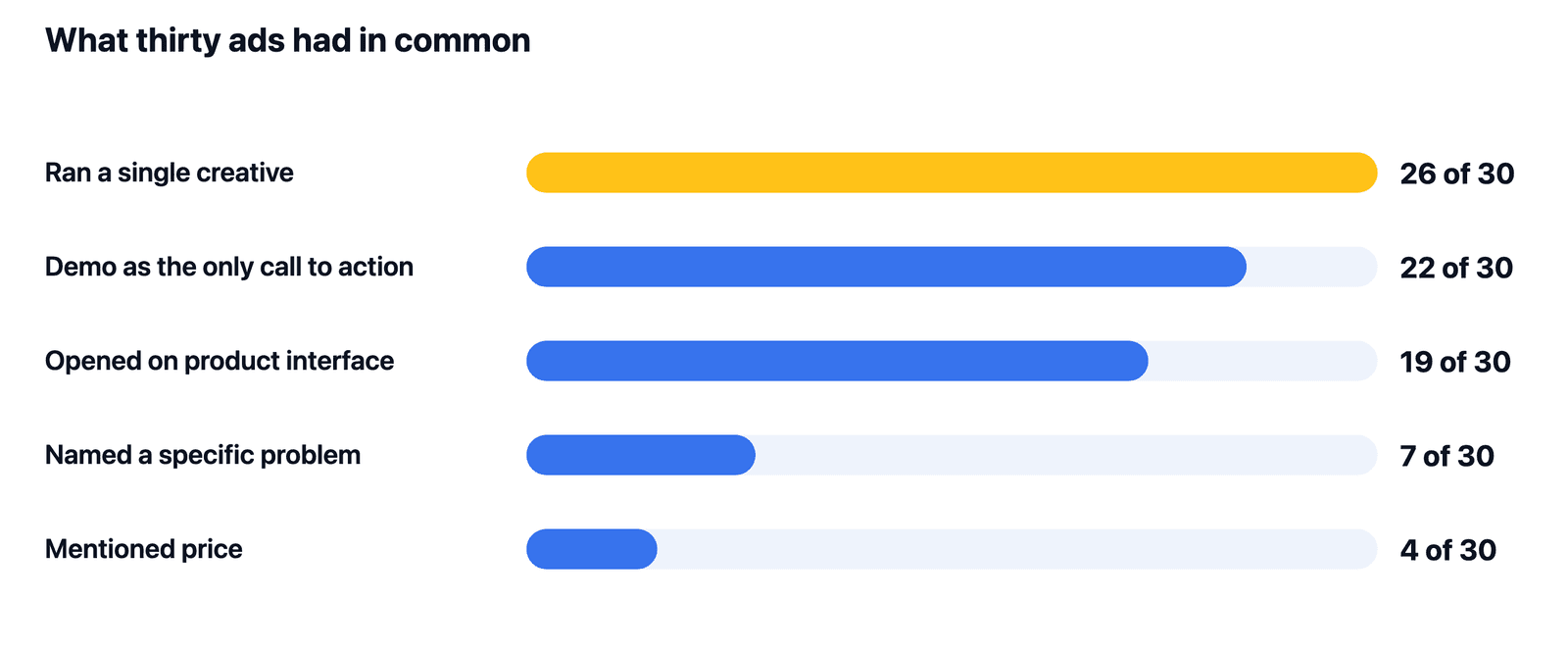
Twenty-six of the thirty were running a single creative with no variants at all. That is the finding that surprised us least and matters most: an advertiser with one ad cannot learn anything about which message works, and has nothing to rotate to when the one they have fatigues.
Twenty-two asked for a demo as the only action. Nineteen opened on product interface, usually a dashboard, before establishing what problem the dashboard solves. Four mentioned price in any form.
Put together, that produces a category of ads showing similar software asking for a similar meeting in similar language. If everyone opens on their dashboard and asks for a demo, none of them is distinguishable while scrolling.
- 26 of 30 ran a single creative with no variants.
- 22 of 30 asked for a demo as the only action.
- 19 of 30 opened on product interface before naming a problem.
- 7 of 30 named a specific problem in the first line.
- 4 of 30 mentioned price at all.
Why is opening on the interface a mistake?
Because a screenshot of software means nothing to somebody who does not already know what the software is for.
Showing the product is a genuine advantage that software has over most categories, and nineteen of thirty advertisers are using it backwards. A dashboard full of charts reads, to a stranger, as a dashboard full of charts. It carries no information about whether this is for them, and the scroll continues.
The seven ads that named a problem first were noticeably easier to place. Reading them, you could say who they were for within a couple of seconds, which is roughly the budget you have.
The order is the whole fix and it costs nothing. Name the problem, then show the resolution. Same footage, same product, one sentence moved to the front.
What did the better ads have in common?
They were specific enough to exclude people, and they were willing to say a number.
The small group that stood out shared two habits. They described a situation rather than a category, so a reader either recognised themselves or did not, and the ones who did not were never going to buy. And several of the four that mentioned price used it as a qualifier rather than a boast, which is the fastest filter available in a lead generation ad.
The median headline across the sample ran nine words and the median video twenty-four seconds. The better ads were not shorter. They spent their length on the problem instead of on the feature list.
None of this requires a bigger production budget. It requires deciding who the ad is not for, which is a harder decision than it is an expensive one.
The stronger ads were not shorter or better produced. They spent their length on the problem instead of the feature list.
What should you do differently on Monday?
Three changes, in the order that they pay off, and the first one is nearly free.
Move the problem to the first line of every ad you are currently running. You do not need new footage, new copy or a new offer to do this, and if nineteen of thirty competitors are opening on their interface, doing it differently costs you an afternoon.
Then build variants. Being one of the twenty-six advertisers running a single creative means you have no way to learn and nothing in reserve when it tires. Three variants of one idea beats one polished asset.
Third, reconsider the demo-only ask. Twenty-two of thirty offer the same thing, which means the demo is not a differentiator and is a high commitment for somebody who met you eight seconds ago.
Then go and look at your own category in the Ad Library. It is free, and it takes about an hour.
At a glance
| What we looked for | Count | Of thirty |
|---|---|---|
| Ran a single creative, no variants | 26 | 87 per cent |
| Demo as the only call to action | 22 | 73 per cent |
| Opened on product interface | 19 | 63 per cent |
| Named a specific problem first | 7 | 23 per cent |
| Mentioned price at all | 4 | 13 per cent |
Bring the specific decision, context, and constraint.
We can help identify the next useful test across your audience, offer, creative, qualification, and sales feedback loop.